Meeting Your Heroes

We all have moments that shape our lives to take us in different directions. For some people, it might be reading a particular book; for others, it might be hearing an influential talk; and for others, it might be just meeting someone. We often don’t realize in the moment that we are being transformed, but as we look back on our lives, it is easy to pick out those turning points. It can be dangerous when those turning points are so closely aligned with people that they become heroes to us. The danger is that they are human, and the possibility of eventual disappointment is huge.

Exposition

I work for Balsamiq, and every summer we all get together from our remote locations and have a week-long retreat. Last year it was in San Francisco, and one of our opening activities was to share a short slideshow of our heroes. One person commented that meeting your heroes can be a real let-down. He showed a slide he had made a few years earlier of his heroes, and then showed how many of them had been crossed off the list for one reason or another. One of the biggest reasons for the X’s was that he had actually met many of them, and they turned out to not be anything like what he thought.

Rising Action

For me, a specific turning point was the RWD Summit 2012, a web conference all about Responsive Web Design. I was a UX Designer on a team without front-end web developer, and was struggling to find a way to help get my designs implemented. I had no experience coding HTML or CSS to that point, and had heard the buzzwords “Responsive Web Design” thrown out, but they always seemed to mean something different each time I heard them.

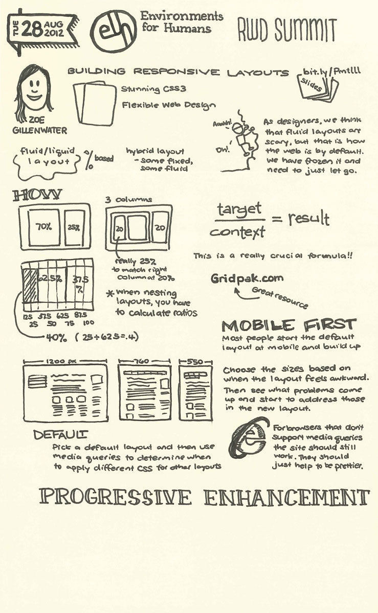
Zoe Gillenwater Sketchnote

There were two specific talks at that conference that seemed to open a door for me. The first was “Building a Responsive Layout” by Zoe Gillenwater. She showed how simple it was to build layouts that were not based on fixed widths, but rather on fluid percentages that could even be nested. She introduced concepts to me such as “mobile first” and “progressive enhancement” in a practical way that I could immediately see how to apply them. Because she combined solid theory with live examples, I felt like I truly understood what the foundations of responsive web design meant, and felt ready to apply them immediately in my own work.

Ben Callahan Sketchnote

The second talk that struck me was “Retrofitting Sites for Responsive Web Design” by Ben Callahan. He walked through the practical example of making the Twitter site responsive as we watched, using the Chrome Dev Tools. That showed me even more some of the basic properties involved in making a site responsive. I also realized that I could start playing with those tools right away to learn different CSS properties, and understand what they meant by seeing what they did when changed.

That insight opened the floodgates for me. I went back to my team and started inspecting the pages after they had tried to implement my design, and I would tweak it and them email them the line number and the CSS code that I wanted changed. Eventually, I got set up to write the code from the beginning, and thus began my journey into becoming a front-end designer. Since that time, I have progressed to writing production-level code, and have been able to design and code a few sites by hand, including my own site with two different skins.

Fast forward to Fall 2013, and I found myself anticipating meeting the two people I hold responsible for getting me into front-end development, Zoe and Ben. The kind folks from Environments for Humans had me out to sketchnote the CSS Dev Conference at the Stanley Hotel in Estes Park, Colorado, and the Artifact Conference at the Biltmore Hotel in Providence, Rhode Island. I set as my goal before the conferences to try and meet Zoe and Ben, as well as Chris Coyier, although meeting him is a [different story altogether]({% post_url 2013-12-08-my-own-cars-moment %}).

Climax

The first night of the CSS Dev Conference included a tour of the haunted hotel that inspired The Shining, and I found myself walking next to none other than Zoe Gillenwater. I introduced myself as the guy there to sketchnote the conference and was shocked when she responded with something like, “Yeah, I know you! I love your sketchnotes!” We started chatting for a minute, this keynote-speaking, book-writing hero of mine and me, and found that we had a lot in common. We both have young kids, we are both passionate about learning new things, and we are both Mormon. Over the next few days of the conference, we had a few opportunities to chat, and we talked about how she got into web development, how she started writing and speaking, as well as fun random stuff about having a young family and trying to figure out a career and balance home life. I left the conference feeling like I had a new friend, which blew all my expectations out of the water.

Two weeks later, I was landing at the airport in Providence, RI, and as I got picked up and driven to the hotel, I rode with, you guessed it, Ben Callahan. We chatted briefly then, and off and on throughout the conference, but didn’t get much time to talk until dinner on the last night. I’ll talk more about that dinner in a minute, but it gave me the chance to sit next to Ben and just talk about his life and his journey to where he is now. Again we found much in common with raising small kids, balancing a career, and learning and growing while giving back. I was so inspired by what he has been able to accomplish.

Falling Action

At dinner that last night in Providence, I had been invited to come out with the workshop presenters and the conference organizers. I felt a little bit like the little kid at Thanksgiving who is invited to the grown-ups’ table for the first time. There were so many people that I admired and respected there. As we talked, it was kind of funny how the circle of inspiration had gone around the group. Brad Frost talked about his experience meeting Jen Simmons for the first time, and realizing that she was the one who wrote “that cool web book.” He said if it wasn’t for her, he wouldn’t be doing what he is now. Ben Callahan shared a similar experience about meeting Christopher Schmitt for the first time. And I was thinking about how it was happening for me! Right then! I wouldn’t be there if not for Ben Callahan, and I was sitting right next to him as if I had some right to be there! I kept my thoughts to myself that night, just happy to be at the table. Maybe next time we are all together, I can share my story.

Dénouement

One of the biggest takeaways from my conversations with both Zoe and with Ben was to start writing. That is the best way to start sharing knowledge and experiences, and begin contributing to this living, growing community we are lucky to be part of. Even if we aren’t already all that we want to be, it is helpful to everyone if we document the process along the way to get there. So here’s hoping I (and all of us) can stay consistent in sharing lessons, mistakes, and successes.

My Process for Post-Event Sketchnoting

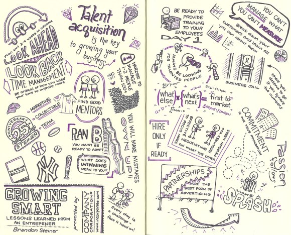
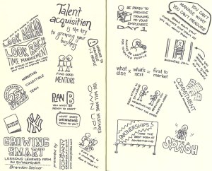
This post wraps up my series of sketchnotes created for The Company Corporation (Incorporate.com). The event was a Q & A session with Brandon Steiner of steinersports.com and went through lessons he learned as an entrepreneur. The session contained tons of great information for small business owners, but was a challenge to sketchnote. All of the other sessions in this series were prepared presentations, so they had a structure, and a natural flow. But this one was more organic, with stories illustrating unconnected points. So the process that I took was different from what I have used with most events, and I thought it would be interesting to share.

Growing Smart sketchnotes basic

I watched the broadcast once in its entirety without capturing any sketchnotes just to get a feel for the content. That helped me realize the approach I wanted to take. Similar to my sketchnotes for the Raising Capital webinar, I wanted to try a different layout than what I have typically used. So when it came time to actually sketchnote the event, I left lots of white space and captured main ideas from the stories presented as usual, but I worked in more of a popcorn layout. As new ideas came up, they just popped onto the page without following a set order or pattern. For a linear presentation where the ideas build on each other, a sketchnote using this structure would be harder for someone reading it to follow, but since the ideas were loosely connected if at all, this worked well.

Growing Smart Sketchnotes colored

Once I was finished with the event, I went back and added some color and some emphasis to the title. With a non-standard layout, the title needed to pop a bit more than normal. Usually, this will be the final step for me. I prefer to do as much as possible live during the event, and will often add color highlights as I go if I’m going to use them in a sketchnote. Since these sketchnotes were for a paying client, I wanted to take a bit more time on each of the stages so that the end result would be the best that it could be.

Finally, I decided to try something else new and add some embellishments. There was so much great content and I wanted to convey that sense immediately. The clean layout that I had with lots of the white space works well for many situations, but I wanted something more. So I went back to the presentation and added some additional points that I didn’t capture during the first pass. I also added illustrations for some of the original points until I felt like I had the effect that I wanted. Since this was pushing me out of my comfort zone a bit, I scanned in the sketchnote at each of the stages, so that if I was dissatisfied with how things turned out, I had something to fall back on. But in the end, I felt that I had a product that worked well and was something I could be proud of.

Hopefully this glimpse into my creative process was interesting for you and sparks ideas for things you could try!

Sketchnotes for webinar on Growing Smart

Back to top | View entire gallery»


Sketchnotes for Webinar on Raising Capital

The third installment of the series for The Company Corporation (Incorporate.com) was another fantastic resource for small business owners. This was focused on how to raise capital for your business, and making sure that you have considered all of the ramifications.

I had noticed that my sketchnotes had all been in the same basic layout: top to bottom and left to right in something of a “Z” pattern. So this time I tried a completely different layout, and I loved it! Doing something different pushed me a bit out of my comfort zone, and I was pleased the with end result. Hopefully you enjoy it too!

Sketchnotes for webinar on raising capital by Incorporate.com

Back to top | View entire gallery»


Sketchnotes for Tax Webinar

The next installment in my continuing series of sketchnotes produced for The Company Corporation (Incorporate.com) is from a webinar about maximizing your tax benefits as a small business owner. This was delivered by Sandy Botkin, from Taxbot.com. He is a CPA and a former trainer for the IRS, so his perspective was invaluable. It was a fantastic session for small business owners about how to make sure that you are taking advantages of the laws that are created to help build your business. I learned a great deal, and enjoyed sketchnoting it.

Sketchnotes for webinar by Incorporate.com and Taxbot

Back to top | View entire gallery»


Webinar by Incorporate.com and SCORE

One good thing leads to another! A couple weeks ago, I posted about Next Thing Now and some sketchnotes that I did for a webinar they put on. Through that event, I was introduced to John Meyer from The Company Corporation (Incorporate.com), who commissioned me to provide sketchnotes for a few webinars. They provide many of these webinars as free resources to small business owners in their Learning Center.

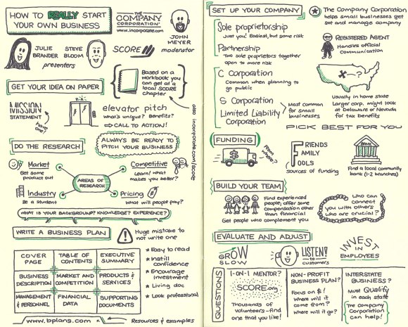
This first session was presented together with SCORE (www.score.org), and was all about how to start your own business. They went through the details of the preparation that you have to do, the options that you have, and the information that you need to know. It was a great session, and one that I would recommend to anyone who owns a small business or is looking to start one. Here are my sketchnotes!

Sketchnotes for webinar by Incorporate.com and SCORE

Back to top | View entire gallery»


Sketchnotes for Next Thing Now Jan 2013

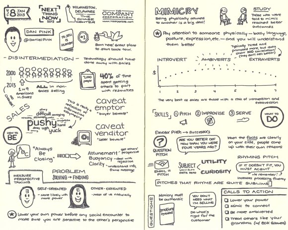
Dan Pink's To Sell Is HumanThis was an exciting week! Tom Nagle contacted me early in the week wanting me to do some sketchnotes for a great speaker series he has organized. Next Thing Now served as the first stop for Dan Pink’s book tour for his new title, To Sell Is Human.

It was such a treat to be able to get an exclusive look at Dan describing some of the principles from a book that I had on pre-order! His talk was an hour, and just scratched the surface of what is in the book. I hope you will enjoy the sketchnotes and then read the whole book. It will be well worth your time.

Sketchnotes for Next Thing Now Jan 2013

Back to top | View entire gallery»


LDS General Conference Oct 2012 Part 2

This is the next installment in my series from the LDS General Conference in October 2012. These sketchnotes are from the Saturday Afternoon general session. You can view my sketchnotes from the Saturday Morning session in my previous post.

Sketchnotes General Conference Oct 2012 Sketchnotes General Conference Oct 2012

LDS General Conference Oct 2012 Part 1

Last April, I posted my sketchnotes from LDS General Conference for the first time. This time around, I decided to not sketchnote during the actual conference. I decided that it had the tendency to make me irritable when one of our four young kids would talk to me or interrupt me in some way. I was too stressed about capturing the talks.

The answer to my dilemma also came from my experience last conference. Because I do Romanian interpretation for some of the sessions, I listed to and sketchnoted those sessions after the fact. This conference I decided to take that approach with every session.

So this is the Saturday morning session; the first in a five-part series as I capture each session and post it here. Hope you enjoy it!

Sketchnotes General Conference Oct 2012 Sketchnotes General Conference Oct 2012

Sketchnote Presentation Oct 2012

I was thrilled to have the opportunity to present on sketchnotes at the annual SORT conference. I have had the chance to present on sketchnotes across the country, and found that the same question seemed to come up every time, “How do I get started?” In this presentation, I lay out what sketchnotes are, why they are so valuable, when and where you can use them, how to do them, and who can do them. There is even a hidden bonus on how to draw stick figures! I thoroughly enjoyed creating and delivering this presentation, and hope that it could help a few more people dive into the blissful world of sketchnotes.


SORT 2012

Now that I work for The Church of Jesus Christ of Latter-day Saints, I have the opportunity to attend a yearly conference put on by employees, for employees. This was my first opportunity to attend, and I had a great time! There was a huge variety of classes available, so every participant could find information that was relevant and useful. For me, this naturally meant two days of sketchnoting! Below are the notes I took, broken out by session. I also was lucky enough to be able to present about sketchnotes, and you can read more about that here: Sketchnote Presentation.

Sort 2012 Sketchnotes 1 Sort 2012 Sketchnotes 2 Sort 2012 Sketchnotes 3 Sort 2012 Sketchnotes 4 Sort 2012 Sketchnotes 5 Sort 2012 Sketchnotes 6 Sort 2012 Sketchnotes 7 Sort 2012 Sketchnotes 8 Sort 2012 Sketchnotes 9 Sort 2012 Sketchnotes 10

Responsive Web Design Summit Aug 2012

I had the fantastic opportunity to participate in a wonderful virtual conference on Responsive Web Design by Environments for Humans. Sadly, I came in at the tail end of the first session, but I was able to catch all the others.I have played with responsive design a bit and just finished designing a site that is responsive. But I still didn’t have the fundamentals down of what it takes to design well for a responsive site. This summit helped fill in the gaps for me and I feel prepared to take on the world! My favorite thing was seeing some of the principles in action during the talks. Particularly with Zoe and Ben, they showed us what it was like to design responsively from the beginning or with an existing site. It was great!

Here are my sketchnotes from the event:

E4H RWD Summit sketchnotes set 1 E4H RWD Summit sketchnotes set 2

LDS Tech Conference 2012

Last week, I posted about how being a Mormon meant that I was able to participate in a semi-annual General Conference. This week, I am posting about how being a Mormon means that I had the chance to participate in a very different conference. Every year for the past three years, The Church of Jesus Christ of Latter-Day Saints (the official name of the Mormon church) has held an LDS Tech Conference. This is a gathering of volunteers who come together to meet with employees to learn about the technology efforts of the LDS Church as well as to contribute to ongoing projects.

I attended this year for the first time and was richly rewarded. The conference spanned Wednesday evening through Friday afternoon, with a keynote address Wednesday, various presentations and speakers in the mornings, and then the chance to work on volunteer projects each afternoon. It was exciting to me to see all the different efforts that are underway to give more church members access to meaningful experiences through the use of technology. I also enjoyed the chance to truly contribute during the course of the conference. It will be great to see how things move forward, and I look forward to participating again next year.

Included here are my sketchnotes from the event.

LDS Tech 2012 Sketchnotes 1 LDS Tech 2012 Sketchnotes 2 LDS Tech 2012 Sketchnotes 3

LDS General Conference April 2012 Part II

A few weeks ago, I posted my sketchnotes captured live during the last LDS General Conference. As I noted in that post, I am also a Romanian interpreter, so there are always a number of talks that I am not able to listen to during the actual conference. Over the course of the weeks that followed, I listened to all of the talks that I “missed” and thought I would share the resulting sketchnotes.

General Conference Apr 2012 Sketchnotes 6 General Conference Apr 2012 Sketchnotes 6

UX/Product Management Webinar

One of my co-workers shared an opportunity to participate in a webinar sponsored by AIPMM about UX design and Product Management. This defines the hybrid that is my life right now, so I was immediately intrigued. Brian Lawley from 280 Group and Mary Piontkowski from Macadamian presented on integrating user experience design into the product lifecycle. It was a fantastic look at how good UX practices can transform products and companies. Naturally, I sketchnoted the event!

AIPMM Webinar 17 Apr 12 Sketchnotes

Lynda.com Tutorials: Dave Crenshaw

One of my co-workers pointed me to these fantastic tutorials by Dave Crenshaw on lynda.com. I enjoyed them so much I wanted to immediately post my sketchnotes and share these with others.

Dave Crenshaw lynda.com sketchnotes

LDS General Conference April 2012

I’m a Mormon. That means so many things, but this last weekend, it meant that I was able to participate in a semi-annual world-wide General Conference. Every April and October, The Church of Jesus Christ of Latter-Day Saints (the official name of the Mormon church) has five two-hour sessions, spread over Saturday and Sunday. It is a fantastic opportunity for us to come and be instructed further about the doctrine that we believe in, and to take a moment to pause from our hectic lives to concentrate on things that really matter most.

For over ten years, I have taken extensive notes at each conference. A couple years ago, those notes transformed into some of my earliest sketchnotes. I have kept that tradition up this year as well, even when it meant using my phone as a small red flashlight because the lights were all turned off in the meetinghouse. Yes, I am a nerd. But I love doing sketchnotes!

In addition to sketchnoting most sessions, I also have the opportunity to participate directly in the conference as a Romanian interpreter. Each language team is a little bit different, but for our team, that means that I get the English text for the talks a week or so in advance of the conference, and the Romanian text anywhere from a few hours to a few days beforehand. I prepare delivering the text, so that when the talk is given, I perform a simultaneous reading, striving to match the speed, tone, and style of the speaker. The most important aspect is to convey the feeling of the message and provide an experience for those who listen in Romanian that is as close as possible to those who listen in English. My favorite part is when speakers like President Thomas S. Monson give a talk, because you never know how much they will stick to the text, and how much they will speak extemporaneously and require live interpretation.

General Conference is significant as a logistical feat—providing access in 93 languages to reach most of the 14,441,346 members around the world. But the most important part is the chance to hear from living prophets, the same as if Moses or Abraham was alive to give us insight into how to live our lives better. What a unique opportunity! I am grateful to have been part of it. Now comes the real challenge: putting all these great messages into practice!

Here is a fantastic infographic from the official lds.org site about the conference (click to see more).

LDS General Conference Infographic

And here are my sketchnotes. General Conference Apr 2012 Sketchnotes 1 General Conference Apr 2012 Sketchnotes 2 General Conference Apr 2012 Sketchnotes 3 General Conference Apr 2012 Sketchnotes 4 General Conference Apr 2012 Sketchnotes 5

EETC 2012

March 2012 marked the second annual Early Education and Technology for Children (EETC) Conference put on by the Waterford Institute. Since I work for Waterford, I had the opportunity to attend the conference. It was a fantastic gathering of people who were focused on how to improve the education and lives of children through the use of technology. I captured each of the keynote and featured speakers in sketchnotes and wanted to make them available. I look forward to a great conference again next year!

EETC 2012 Sketchnotes 1 EETC 2012 Sketchnotes 2 EETC 2012 Sketchnotes 3

Why I Sketchnote: Confessions of a Compulsive Note-Taker

I love to write. Not the novel-creating, prize-winning kind of writing, just the act of scratching a pen across paper. Growing up as a child, I wrote all kinds of things and found that I enjoyed playing with letters. My dad is something of an artist, and I always dreamed that I would be too, but that seemed to elude me. Writing though—that was something I could do. My penmanship improved in direct proportion to the number of girls that I “fell in like” with as I wrote each one fresh new reams of notes expressing my undying, albeit fleeting, affection.

Formal education was the perfect forum to develop my love for writing. I had a different notebook for each subject, and took notes in every class. I would like to think that I also reviewed those notes at some point, but I wouldn’t swear to that. The more I had to write, the smaller my writing got, and I felt a great sense of accomplishment at using a fraction of the paper that other people used. This wasn’t due to an over-zealous eco-friendly bent, but sadly just to my pride. I got a sense of sick pleasure at the look of shock on people’s faces as they saw my notes, though their shock was probably more that someone would invest so much time and energy into something that then required even more time and energy to try and read later!

Sketchnote Early Notebook

As I got to college, I started taking notes outside of classes as well. It got to be something of a guilty obsession. I carried around a pocket notebook, and recorded particularly meaningful conversations or my thoughts and impressions of lectures, talks, even Sunday School classes. This was all separate from my journal, which I also kept regularly. I created a cover for my pocket notebook to help it last longer, and used a small laminated sheet behind the paper to make sure that I had a hard surface so I could write smaller.

Planner doodles

After I was married, my wife encouraged me to focus on developing my own style of stick figures or something equally simple. I began illustrating my planner with small, simple pictures and found that I loved doodling as much as writing. I graduated my pocket notebook to a small Moleskine that didn’t require my creating an additional cover, and started incorporating small doodles into my notes there as well. These became my first sketchnotes, long before I had heard that term, or knew that it was now socially acceptable.

The Back of the Napkin

My journey was nearing its natural arrival to the blissful land of official sketchnoting. Dan Roam’s book, The Back of the Napkin, freed me to start doodling and sketching at work. If anyone laughed or asked what on earth I thought I was doing, I had a published work to cite as evidence. I began seeking out opportunities to incorporate pictures into my work, and it became the running joke on my team to guess how long it would be into a meeting before I got up to the whiteboard and starting drawing something.

Sketchnote Moleskine Notebook

I started following Dan on Twitter and through him, I found mention of a clandestine movement called… sketchnoting. He unknowingly led me to a video of Eva-Lotta Lamm describing how she does sketchnoting, and the planets aligned. I had found my calling. Since then, I have transformed my work notebook into a sketchbook and began enjoying meetings much more. I also have a Moleskine dedicated to events that merit sketchnotes, whereas I use my other notebooks to practice with different meetings or events that I don’t actually want to capture and remember. One of my new favorite pastimes is browsing other peoples' work on Sketchnote Army.

The remarkable thing to me has been the way that people resonate with sketchnotes. People at work ask if they can sit next to me during company meetings so that they can watch me take notes. My kids even like to look at what I have done at work because there are fun pictures. Hopefully you connect with them as well. If so, come back often and I will keep posting my latest sketchnotes. Even better, give it a try yourself!


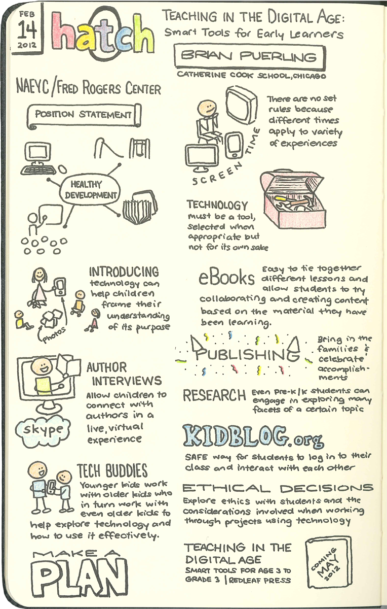
Hatch Early Learning Webinar February 2012

During the day, I masquerade as a Product Owner and UX Designer for a non-profit educational software company. This week I had the opportunity to attend a webinar put on by Hatch called “Teaching in the Digital Age: Smart Tools for Early Learners.” Brian Puerling from the Catherine Cook School in Chicago presented about how his school has been able to integrate technology effectively.

One point he made repeatedly resonated with me, and that is that technology should not be used for its own sake. This is true in all industries, but especially in education. There should be a purpose and a goal to every activity, and then technology can become a tool to help facilitate that purpose.

Some of the examples that Puerling gave struck me as fascinating. Even in working with preschool students, they are able to use technology as a way to open up possibilities and allow them to express themselves creatively. Students collaborate to create eBooks which are then published and presented at a publishing party to parents. Students works with a “tech buddy,” older students who serve as mentors on how to use technology, and in turn have tech buddies of their own. After studying a book or particular author, they have a Skype interview with that author and allow the students to connect in an extremely personal way.

Driving all of these examples was a concerted effort with dedicated planning to ensure that the outcomes would match the intended goal. This webinar was a great reminder of all the possibilities that technology offers educations, but also that only its deliberate use in proper situations will produce meaningful results.

Included here are my sketchnotes.

Hatch Webinar Sketchnotes Feb 12

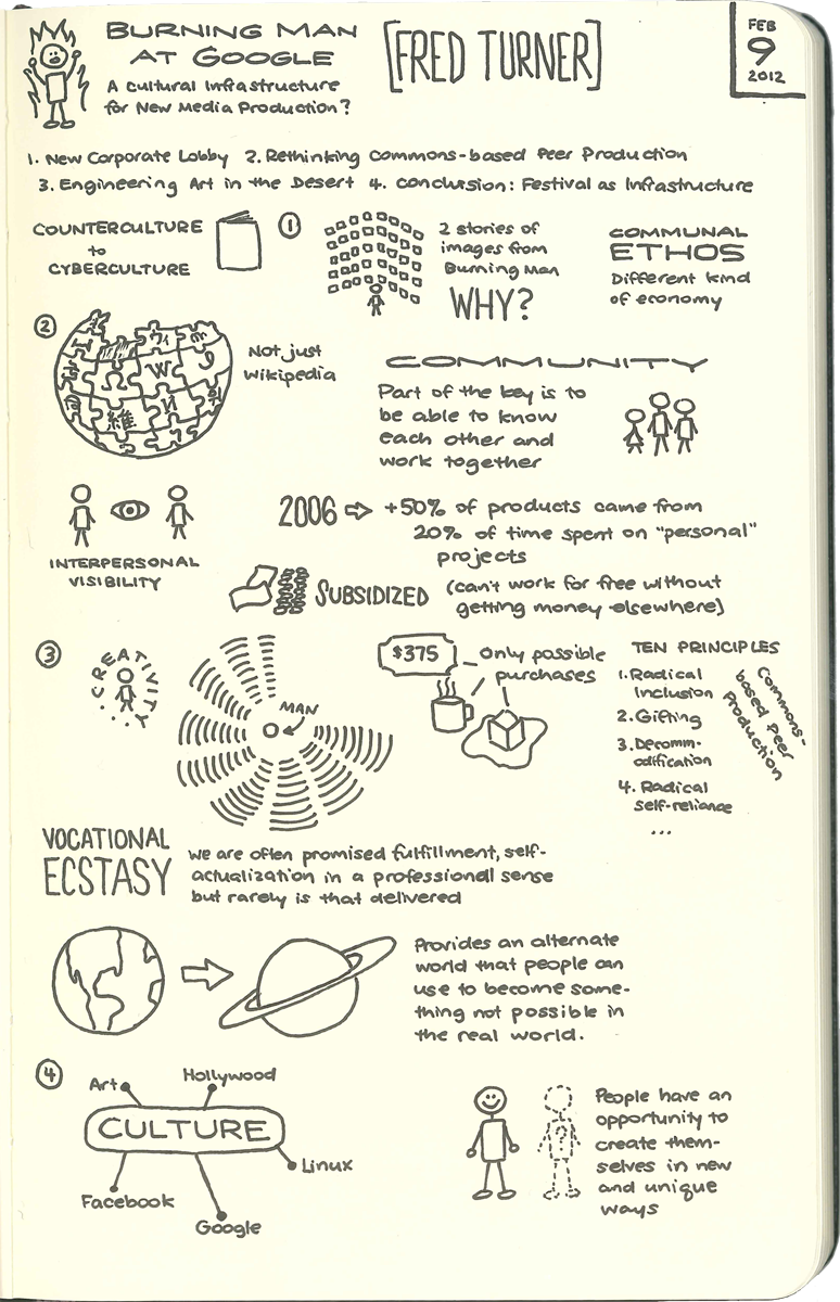
Human-Computer Interaction (Part 2)

This second installment of my Stanford Human-Computer Interaction course went in a totally different direction. Where the first lecture focused around the efforts and experience of a single individual, this second lecture took a much broader look at changing landscape of technical production. The lecture was titled “Burning Man at Google, A Cultural Infrastructure for New Media Production?” and was given by Fred Turner.

The main point that I took away from this lecture is that the phenomenon of commons-based peer production is starting to change our industry completely. Products like Wikipedia, Linux, and many others are built on the efforts of volunteers, many of whom are highly skilled and are contributing in a different kind of economy than ever before. Contributors are not paid, and so this is driving a new kind of community where people build on each other’s strengths and skills without thought of compensation. As more companies recognize and start to harness the potential of this kind of production, projects of a different nature and scale will become our new reality.

Here are my sketchnotes.

Stanford HCI Sketchnotes

Human-Computer Interaction (Part 1)

Every once in a while, you make a discovery that makes you feel as if you have been living under a rock. For me, this happened last week as I discovered iTunes University. I had no idea that colleges and universities all over the country have been making premium learning available for free. Economics classes have always taught, “There ain’t no such thing as a free lunch,” but this proves them wrong! I found a seminar series from Stanford University on Human-Computer Interaction, so this will be the first in a ten-part series.

In this first installment, Dr. Shumin Zhai spoke on progressive user interfaces. He has been involved in the research and development of the gesture keyboard, an on-screen keyboard that allows for words to be drawn as a gesture instead of tapped out. The fundamental design principle that he discussed was the tension between ease and efficiency.

Ease refers to a design that allows a user to walk up to a new interface and use it without problem. It is a recognition task, so as a designer, you are building on what a user already already uses or intuitively knows. This is the principle behind the modern graphical user interface (GUI) that is largely responsible for the explosion of the personal computer.

Efficiency refers to a design that requires minimal effort. This is a recall task, so it relies on users learning the action to the point where they can perform it without instructions or scaffolding. This is embodied in the world of command-line computing where users can quickly perform tasks, but are required to independently remember the syntax required. A more everyday example of this design is keyboard shortcuts. Some people use these obsessively while most others never bother.

In the battle between ease and efficiency, ease almost always wins. This is mostly due to the fact that we typically value today’s time over that of tomorrow. So for a designer, the secret is to find a way to naturally move users from ease to efficiency. This is the task that Dr. Zhai set out to accomplish with the gesture keyboard, and he shared the principles behind this transition.

In order to move users from ease to efficiency, two things are required: information redundancy and chunking. Information redundancy basically means building in practice. Users have to perform the same actions over and over, and as they do, they can move from recognition to recall. Recall is much more efficient but also more cognitively demanding. With chunking, Dr. Zhai found that people learn things in chunks, not discrete items. So to have the greatest effect, the practice should be with chunks of information.

The great challenge for designers now is to explore ways to help users move from ease to efficiency in all different contexts. Sometimes it won’t be possible however, and in those cases, we need to design for users at both ends of the spectrum. As previously mentioned, ease almost always wins over efficiency, but it doesn’t have to completely replace efficiency.

Take a minute to look through my sketchnotes for more detail.

Stanford HCI Sketchnotes

Digital Learning Day 2012

I am a nerd. I take notes in a Star Wars Moleskine notebook and can’t wait for the Lego Moleskines to come out. I also have a decent collection of gadgets—I currently use an iPhone, an iPad, a Macbook Air, a Macbook Pro and an iMac. So a national Digital Learning Day is a great thing in my eyes. My department at work all tuned in for the broadcast of the national town hall.

The event was hosted by former West Virginia governor, Bob Wise, and began with a short discussion featuring Arnie Duncan, the U.S. Secretary of Education, and Julius Genachowski, FCC Chairman, and then moved to Skype calls with schools around the country. It was a feel-good celebration of current efforts at the high school level to integrate technology more into the school day. However, our company is focused on early education, and there was nothing discussed for the elementary school level, so we skipped the last half hour. Overall, I wholeheartedly support this event and hope that this movement of incorporating effective technology into our school system continues to gain momentum.

Here are my sketchnotes of the event.

Digital Learning Day 2012 Sketchnotes


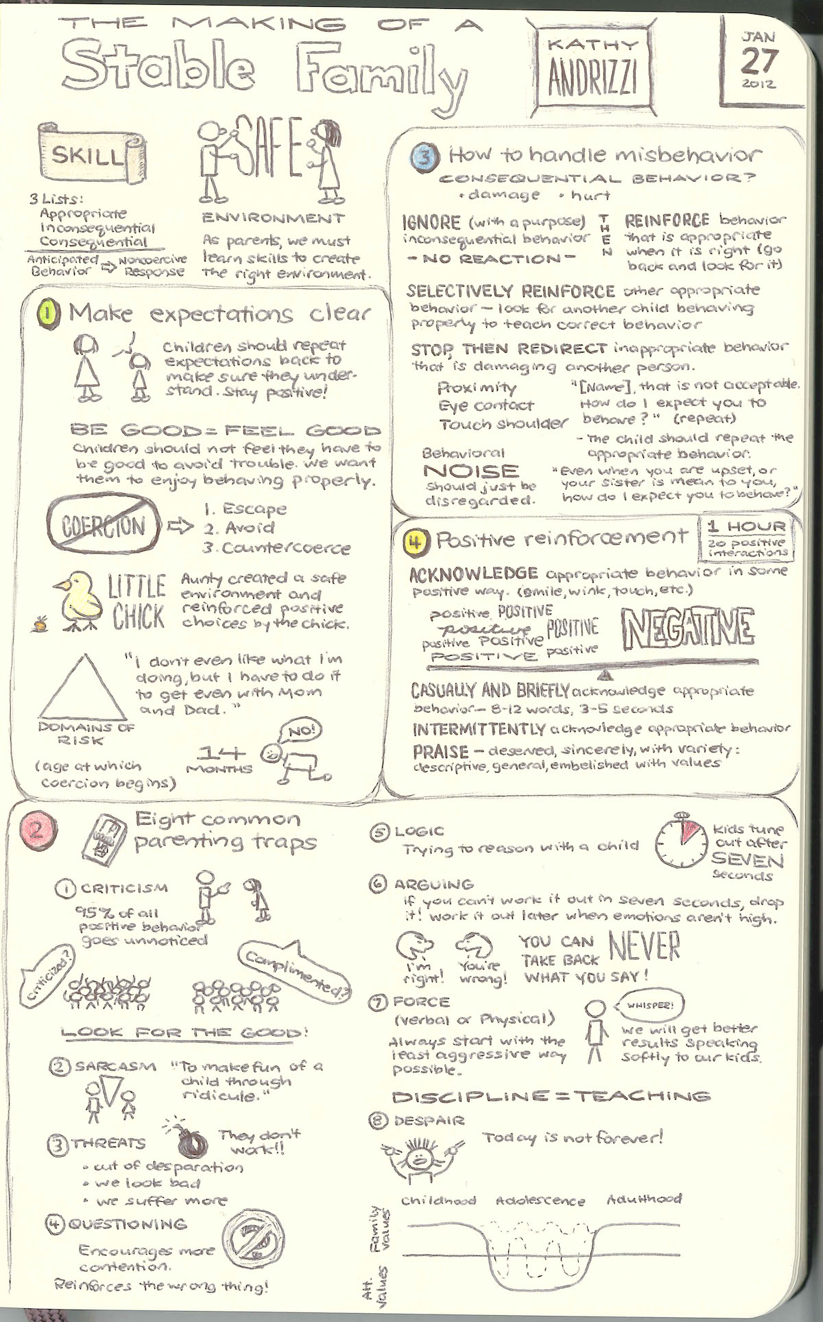
Parenting Class Jan 2012

The most challenging and difficult occupation today is that of parent. Similar to most jobs, you are expected to learn mostly through on-the-job training, except that the training part is a misnomer. You have no supervisor, no one checks your work, there are no performance reviews; in short, you are completely on your own. Of all the things that might be required in our education system, somehow these skills were left out.

I attended a parenting class taught by Kathy Andrizzi on January 27, 2012, and have been digesting it since. The class was based on the principles taught in The Power of Positive Parenting, written by Kathy’s uncle, Dr. Glenn Latham.

I captured the event with sketchnotes and am including them here.

Parenting Class Sketchnotes


Hand-Drawn Presentation

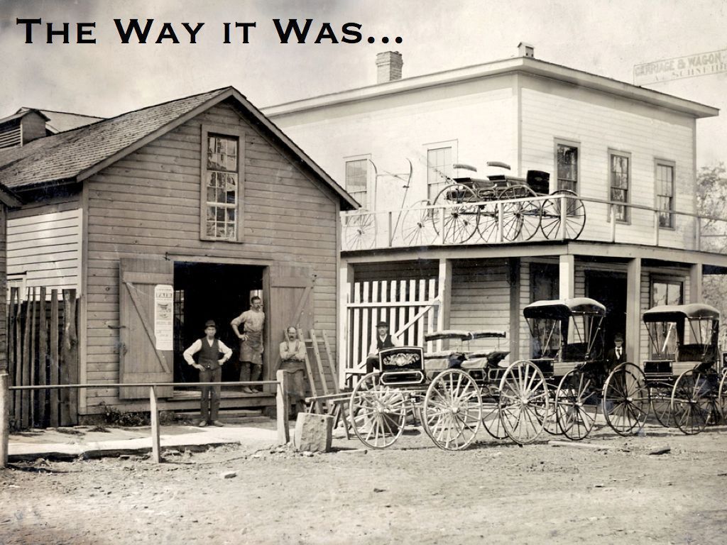
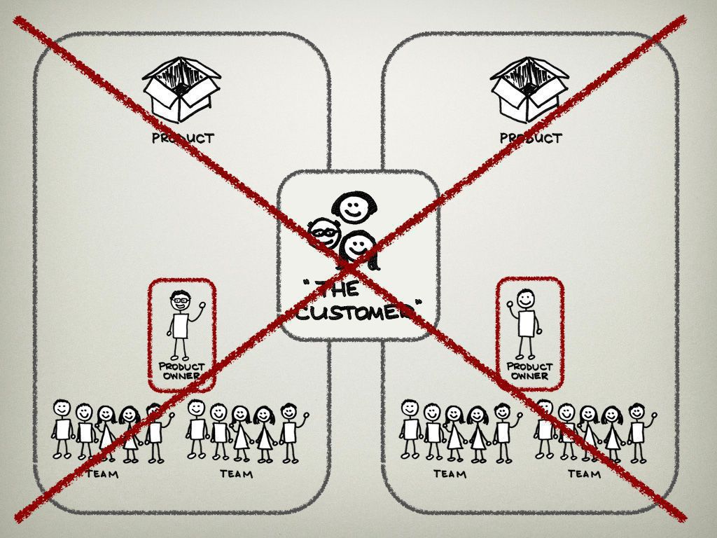
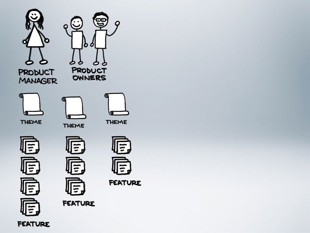
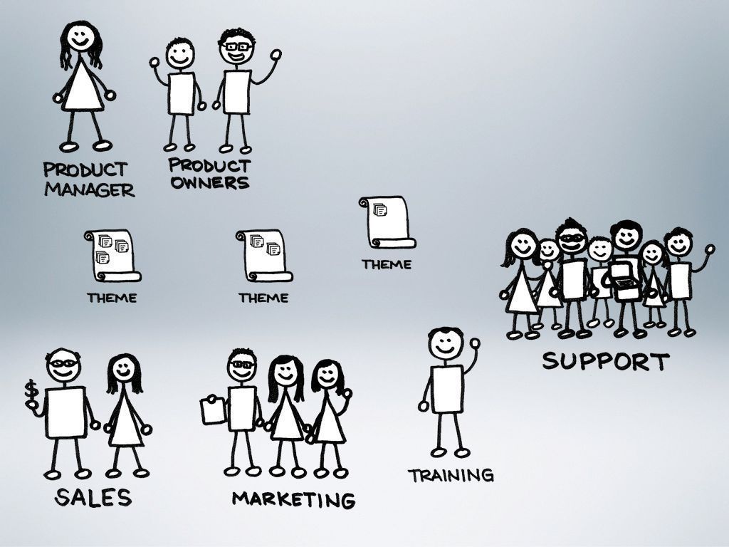
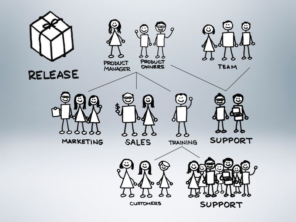
A few months ago, we started adding to our Product Management group at my day job. Previously, I was the only Product Owner, and I was swamped. Many people were confused about how we were going to structure our group and how they would work together with us. I created a presentation to explain how things were before our change, and how we expected them to become with the additions to our group.

I decided that the presentation should be one that I enjoyed creating, and hopefully everyone else would enjoy seeing as well. I grabbed a couple introductory images for each section, but then hand-drew all the rest of the images. There are almost no words in the slide deck, and it purposely does not stand on its own. This is not a slideument—a term coined by Garr Reynolds to describe a slide deck that is really a document. Without my presenting, the slides alone don’t make sense. Although I only included a few example slides here, the half-hour presentation contains almost 200 slides. Instead of creating complicated builds and animations on a few slides, I constructed the builds over the course of a few slides, and move through them quickly. The result is a deck that I enjoy and has been effective in explaining our organization and process.

Slide 1

Slide 2

Slide 3

Slide 4

Slide 5

Slide 6

Slide 7

Slide 8

Slide 9

Slide 10

Slide 11

Slide 12


Creating a magical menu

Over the past couple months, I have been playing around in WordPress to try and create the site that I had in my mind. I was referred to WordPress by a friend and have been thrilled with what I found. I thought I would chronicle my journey to finally creating the menu of my dreams.

Step 1: Picture the dream

The first step was to create an image to upload as a header image. I knew that I wanted to eventually create a menu with fun images for each page (menu item), so I began by creating some sketches and combining them into a single image in Photoshop. The theme I was using in WordPress allowed me to upload a header image, so with a bit of fiddling, I finally got it so that the sketches lined up over the menu items. The problem was that the entire image was a big link to the home page. Through some basic usability testing, I found that everyone who used the site tried first to click on the image to get to a page, but then was taken back to the home page.

Step 2: Stop the trickery

Now I had feedback that people enjoyed the sketches, but the site wasn't terribly usable. So I set out to remove the link from the image so that if people tried to click the images, they at least wouldn't be taken to the wrong place. Fortunately, there is a great support forum for WordPress, and I was able to quickly get some help in overriding the CSS. Basically, I removed the header image through the admin console, and then put it back with the following CSS code. And, voila! A non-clickable addition to my menu items looked fun and stopped tricking people.

#menu { background: url("benjaminsnorris.files.wordpress.com/2011/12/p…") no-repeat scroll 5px -40px transparent; height: 125px; }

.menu-navigation-container { margin-top: 95px; }

Step 3: Enter the magic

Life felt much better. My site no longer offended me, Christmas was fast approaching, and Santa had finished early. I set out to transform a static, dead menu into one that had a bit of sizzle and pop. I decided to go for the image sprite model, so I searched for some tutorials, found some great help, and then tinkered with the CSS to make it work in WordPress. Hopefully others can benefit from my short struggle.

1. Assemble the sprite

My first task was to create in a single image everything that I wanted to be in the menu. I found the right font, and added the page titles underneath my little sketches. This would become the first row and would represent the menu items in a non-selected, non-rollover state.

Next, I extended the canvas of my image by a factor of three (for me that meant going from 140 pixels to 420 pixels). Then I selected everything that I had created so far and duplicated it twice. I took one of the duplicates and dragged it to the very bottom, and the other went in the middle. Tis meant I ended up with three rows of my images and page titles.

Finally, I got down to the real work. The final row was going to become the selected state for me, and that was going to be easier. I just wanted to change the color of the image as well as the page title. The middle row was to become the rollover state. I changed the color of the text, but the images we more complex. This needed to be fun to use, so I wanted to add a little something to each of the images. I sketched out ideas in paper with a Sharpie, and then when I had what I liked, I scanned it in, played in Photoshop until it worked with what I already had, and then I was set. That was the fun part!

If you’re trying this as well, it’s important to note the size of each piece of your sprite. I already knew the height of each row, but I needed to determine the width of each menu item as well. You’ll want to write down the width for each item, as you need it in the final step.

2. Prepping the page

Since I am using a hosted WordPress blog, the theme already handles the menu, but it can be overridden with CSS. I first needed to clear out the menu that was already being displayed as text links, and get the size of the menu right for the images I was going to use. I don't claim to be a CSS ninja, so this might not be the most elegant way to accomplish this goal, but it worked for me. I added the following lines to my CSS.

#menu li { float:left; position:relative; display:inline; }

#menu li:hover > a,#menu ul ul :hover > a { color:transparent; }

#menu ul li.current_page_item > a,#menu ul li.current_page_ancestor > a,#menu ul li.current-menu-item > a { color:transparent; }

#menu { width:800px; list-style:none; height:140px; }

#menu li a { height:140px; float:left; color:transparent; }

3. Putting it all together

The last step is to actually construct the menu in CSS. I viewed my page's source (as easy as right-clicking on the page and selecting View Page Source) in order to get the IDs of each menu time. Essentially, I had to tell the browser to show a particular piece of your sprite depending on whether the menu item is just being displayed, is selected, or is rolled-over. For each menu item, you need code in the CSS specifying which piece should be shown. Included here is the code that worked in WordPress—if you are trying this as well but using something other than WordPress the code might change slightly, but the basic idea is the same.

/Specify the piece of the image that should display for the Home menu item in its normal state/ #menu-item-59 a { width:75px; background:url(‘http://benjaminsnorris.files.wordpress.com/2011/12/presentation-design-sketchnote-menu.png') no-repeat scroll 0 0 transparent; }

/When the user rolls over Home, the image should jump down to the second line/ #menu-item-59 a:hover { background-position:0 -140px; /These are X, Y coordinates. So the image starts from 0 (the left edge), but down 140 pixels, and is going to show 75 pixels over since that is the width/ }

/And finally when Home is selected, the image should jump to the third line/ #menu-item-59.current-menu-item a { background-position:0 -280px; }

You do the same thing for each menu item. The only thing that will change for each is the X coordinate for each item. It will simply be the X coordinate of the previous item minus that item’s width. So, my second menu item is at -75px 0px, or 75 pixels to the right of the top left corner. My third menu item is at -200px 0px, and so on. Do that for each item, and you are set!

The finishing touch was spacing out the menu items, and making sure that only the right pieces of the image were displayed. My last bit of CSS code did just that.

#menu a { margin:4px 6px; padding:0; }

Basking in the goodness

In the end, I was finally able to enjoy the menu I had dreamed about. Thanks to a lot of help, and a fair amount of trial and error, my sketches came to life!