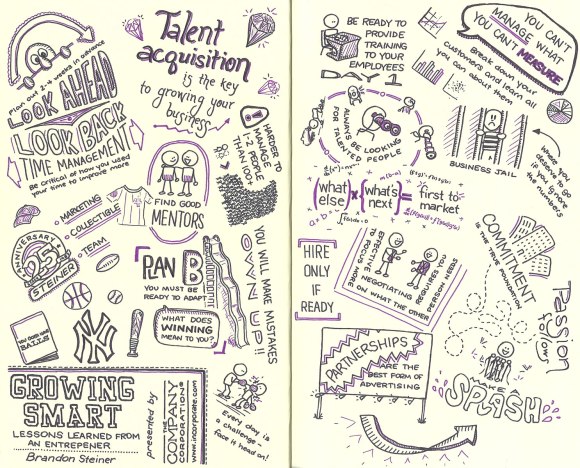
This post wraps up my series of sketchnotes created for The Company Corporation (Incorporate.com). The event was a Q & A session with Brandon Steiner of steinersports.com and went through lessons he learned as an entrepreneur. The session contained tons of great information for small business owners, but was a challenge to sketchnote. All of the other sessions in this series were prepared presentations, so they had a structure, and a natural flow. But this one was more organic, with stories illustrating unconnected points. So the process that I took was different from what I have used with most events, and I thought it would be interesting to share.
I watched the broadcast once in its entirety without capturing any sketchnotes just to get a feel for the content. That helped me realize the approach I wanted to take. Similar to my sketchnotes for the Raising Capital webinar, I wanted to try a different layout than what I have typically used. So when it came time to actually sketchnote the event, I left lots of white space and captured main ideas from the stories presented as usual, but I worked in more of a popcorn layout. As new ideas came up, they just popped onto the page without following a set order or pattern. For a linear presentation where the ideas build on each other, a sketchnote using this structure would be harder for someone reading it to follow, but since the ideas were loosely connected if at all, this worked well.
Once I was finished with the event, I went back and added some color and some emphasis to the title. With a non-standard layout, the title needed to pop a bit more than normal. Usually, this will be the final step for me. I prefer to do as much as possible live during the event, and will often add color highlights as I go if I’m going to use them in a sketchnote. Since these sketchnotes were for a paying client, I wanted to take a bit more time on each of the stages so that the end result would be the best that it could be.
Finally, I decided to try something else new and add some embellishments. There was so much great content and I wanted to convey that sense immediately. The clean layout that I had with lots of the white space works well for many situations, but I wanted something more. So I went back to the presentation and added some additional points that I didn’t capture during the first pass. I also added illustrations for some of the original points until I felt like I had the effect that I wanted. Since this was pushing me out of my comfort zone a bit, I scanned in the sketchnote at each of the stages, so that if I was dissatisfied with how things turned out, I had something to fall back on. But in the end, I felt that I had a product that worked well and was something I could be proud of.
Hopefully this glimpse into my creative process was interesting for you and sparks ideas for things you could try!


