Hand-Drawn Presentation

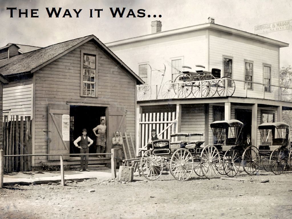
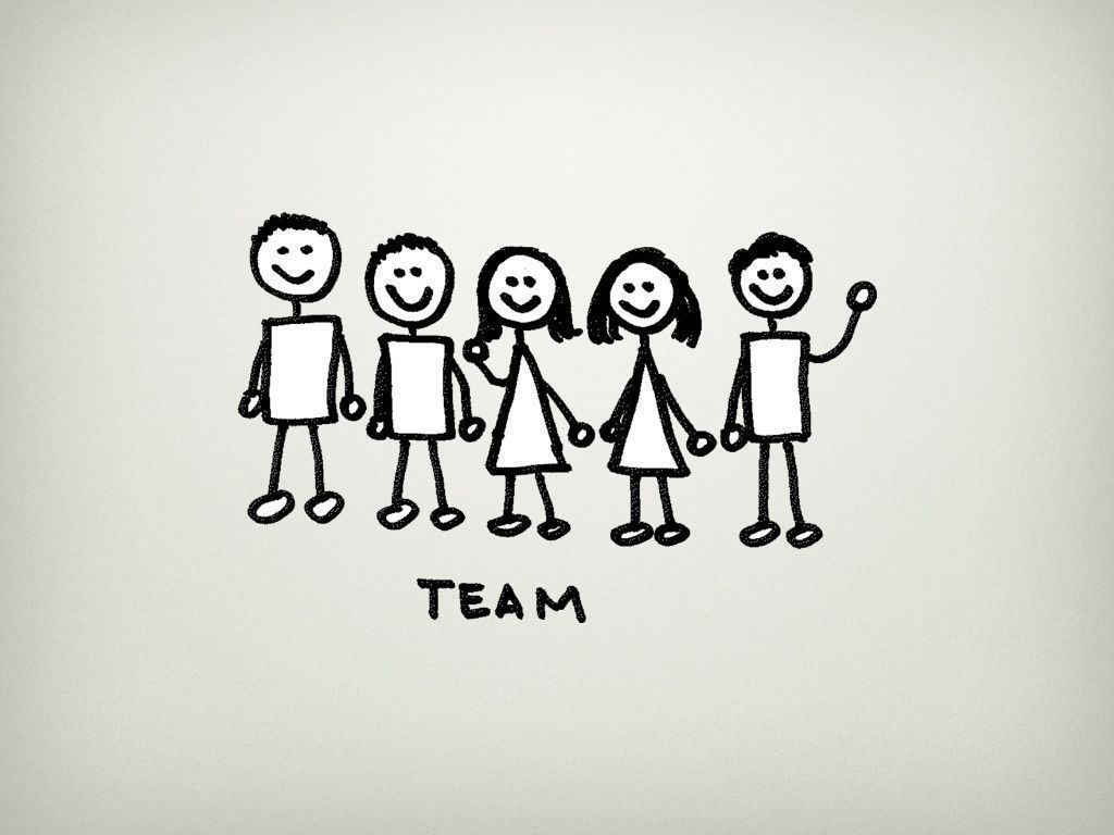
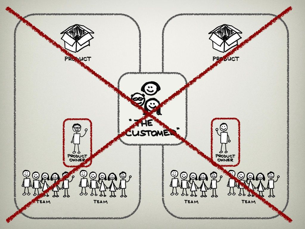
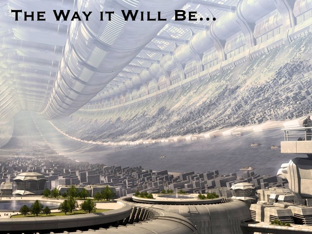
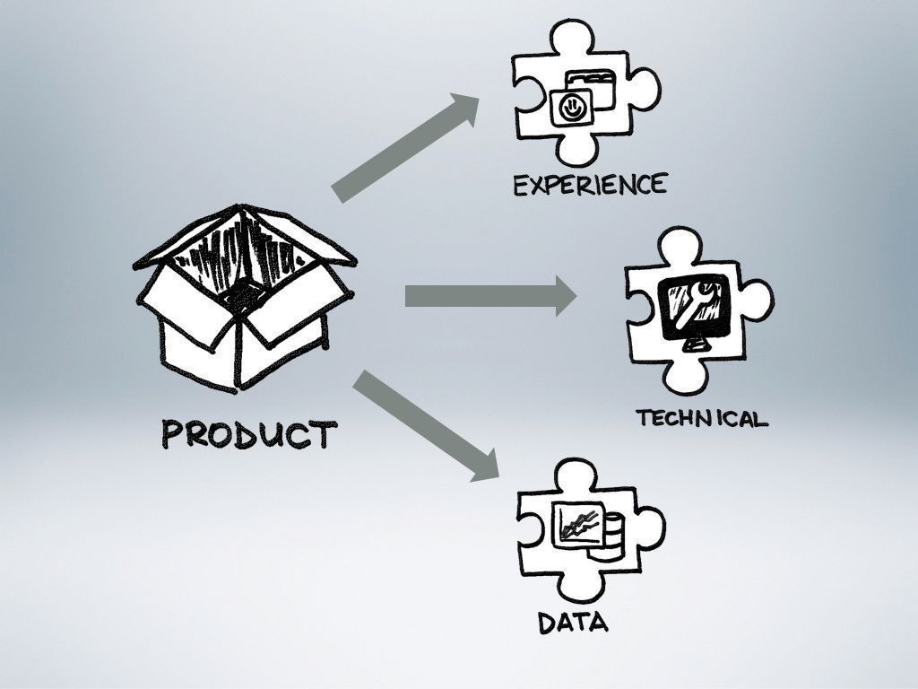
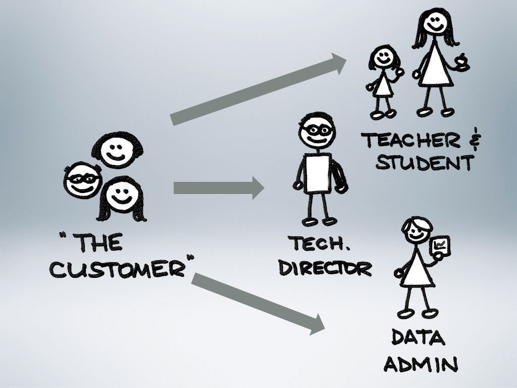
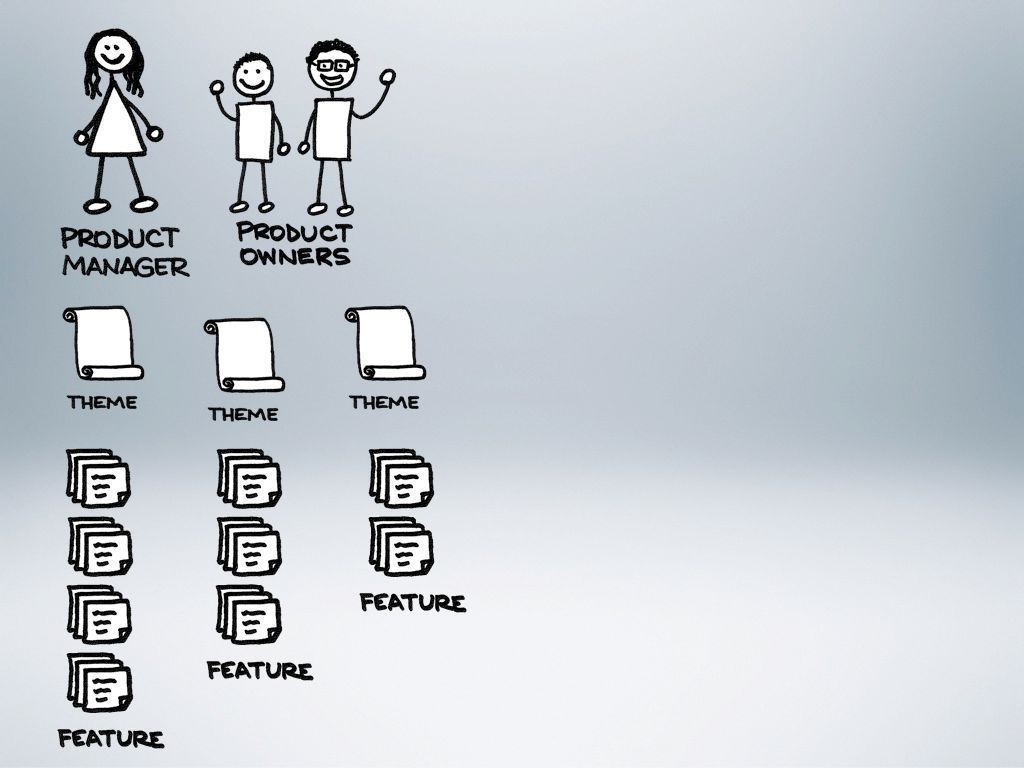
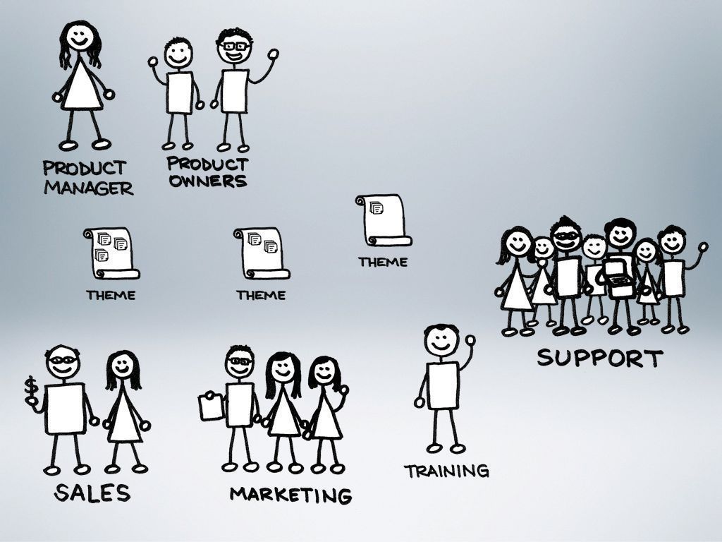
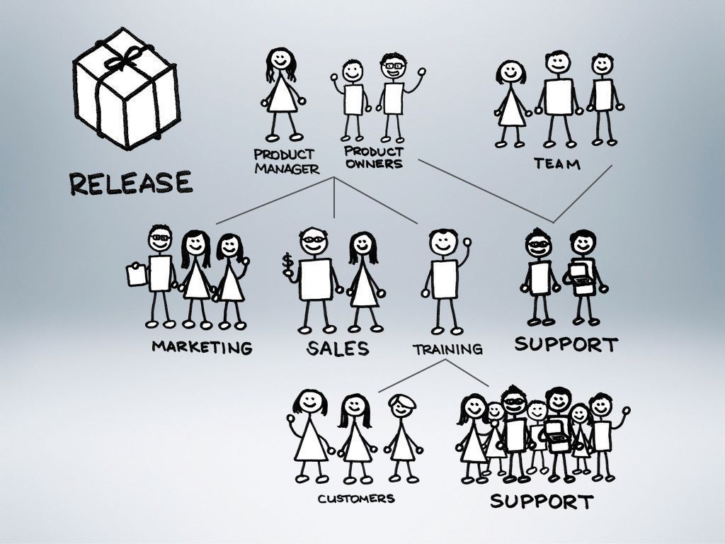
A few months ago, we started adding to our Product Management group at my day job. Previously, I was the only Product Owner, and I was swamped. Many people were confused about how we were going to structure our group and how they would work together with us. I created a presentation to explain how things were before our change, and how we expected them to become with the additions to our group.

I decided that the presentation should be one that I enjoyed creating, and hopefully everyone else would enjoy seeing as well. I grabbed a couple introductory images for each section, but then hand-drew all the rest of the images. There are almost no words in the slide deck, and it purposely does not stand on its own. This is not a slideument—a term coined by Garr Reynolds to describe a slide deck that is really a document. Without my presenting, the slides alone don’t make sense. Although I only included a few example slides here, the half-hour presentation contains almost 200 slides. Instead of creating complicated builds and animations on a few slides, I constructed the builds over the course of a few slides, and move through them quickly. The result is a deck that I enjoy and has been effective in explaining our organization and process.

Slide 1

Slide 2

Slide 3

Slide 4

Slide 5

Slide 6

Slide 7

Slide 8

Slide 9

Slide 10

Slide 11

Slide 12


Creating a magical menu

Over the past couple months, I have been playing around in WordPress to try and create the site that I had in my mind. I was referred to WordPress by a friend and have been thrilled with what I found. I thought I would chronicle my journey to finally creating the menu of my dreams.

Step 1: Picture the dream

The first step was to create an image to upload as a header image. I knew that I wanted to eventually create a menu with fun images for each page (menu item), so I began by creating some sketches and combining them into a single image in Photoshop. The theme I was using in WordPress allowed me to upload a header image, so with a bit of fiddling, I finally got it so that the sketches lined up over the menu items. The problem was that the entire image was a big link to the home page. Through some basic usability testing, I found that everyone who used the site tried first to click on the image to get to a page, but then was taken back to the home page.

Step 2: Stop the trickery

Now I had feedback that people enjoyed the sketches, but the site wasn't terribly usable. So I set out to remove the link from the image so that if people tried to click the images, they at least wouldn't be taken to the wrong place. Fortunately, there is a great support forum for WordPress, and I was able to quickly get some help in overriding the CSS. Basically, I removed the header image through the admin console, and then put it back with the following CSS code. And, voila! A non-clickable addition to my menu items looked fun and stopped tricking people.

#menu { background: url("benjaminsnorris.files.wordpress.com/2011/12/p…") no-repeat scroll 5px -40px transparent; height: 125px; }

.menu-navigation-container { margin-top: 95px; }

Step 3: Enter the magic

Life felt much better. My site no longer offended me, Christmas was fast approaching, and Santa had finished early. I set out to transform a static, dead menu into one that had a bit of sizzle and pop. I decided to go for the image sprite model, so I searched for some tutorials, found some great help, and then tinkered with the CSS to make it work in WordPress. Hopefully others can benefit from my short struggle.

1. Assemble the sprite

My first task was to create in a single image everything that I wanted to be in the menu. I found the right font, and added the page titles underneath my little sketches. This would become the first row and would represent the menu items in a non-selected, non-rollover state.

Next, I extended the canvas of my image by a factor of three (for me that meant going from 140 pixels to 420 pixels). Then I selected everything that I had created so far and duplicated it twice. I took one of the duplicates and dragged it to the very bottom, and the other went in the middle. Tis meant I ended up with three rows of my images and page titles.

Finally, I got down to the real work. The final row was going to become the selected state for me, and that was going to be easier. I just wanted to change the color of the image as well as the page title. The middle row was to become the rollover state. I changed the color of the text, but the images we more complex. This needed to be fun to use, so I wanted to add a little something to each of the images. I sketched out ideas in paper with a Sharpie, and then when I had what I liked, I scanned it in, played in Photoshop until it worked with what I already had, and then I was set. That was the fun part!

If you’re trying this as well, it’s important to note the size of each piece of your sprite. I already knew the height of each row, but I needed to determine the width of each menu item as well. You’ll want to write down the width for each item, as you need it in the final step.

2. Prepping the page

Since I am using a hosted WordPress blog, the theme already handles the menu, but it can be overridden with CSS. I first needed to clear out the menu that was already being displayed as text links, and get the size of the menu right for the images I was going to use. I don't claim to be a CSS ninja, so this might not be the most elegant way to accomplish this goal, but it worked for me. I added the following lines to my CSS.

#menu li { float:left; position:relative; display:inline; }

#menu li:hover > a,#menu ul ul :hover > a { color:transparent; }

#menu ul li.current_page_item > a,#menu ul li.current_page_ancestor > a,#menu ul li.current-menu-item > a { color:transparent; }

#menu { width:800px; list-style:none; height:140px; }

#menu li a { height:140px; float:left; color:transparent; }

3. Putting it all together

The last step is to actually construct the menu in CSS. I viewed my page's source (as easy as right-clicking on the page and selecting View Page Source) in order to get the IDs of each menu time. Essentially, I had to tell the browser to show a particular piece of your sprite depending on whether the menu item is just being displayed, is selected, or is rolled-over. For each menu item, you need code in the CSS specifying which piece should be shown. Included here is the code that worked in WordPress—if you are trying this as well but using something other than WordPress the code might change slightly, but the basic idea is the same.

/Specify the piece of the image that should display for the Home menu item in its normal state/ #menu-item-59 a { width:75px; background:url(‘http://benjaminsnorris.files.wordpress.com/2011/12/presentation-design-sketchnote-menu.png') no-repeat scroll 0 0 transparent; }

/When the user rolls over Home, the image should jump down to the second line/ #menu-item-59 a:hover { background-position:0 -140px; /These are X, Y coordinates. So the image starts from 0 (the left edge), but down 140 pixels, and is going to show 75 pixels over since that is the width/ }

/And finally when Home is selected, the image should jump to the third line/ #menu-item-59.current-menu-item a { background-position:0 -280px; }

You do the same thing for each menu item. The only thing that will change for each is the X coordinate for each item. It will simply be the X coordinate of the previous item minus that item’s width. So, my second menu item is at -75px 0px, or 75 pixels to the right of the top left corner. My third menu item is at -200px 0px, and so on. Do that for each item, and you are set!

The finishing touch was spacing out the menu items, and making sure that only the right pieces of the image were displayed. My last bit of CSS code did just that.

#menu a { margin:4px 6px; padding:0; }

Basking in the goodness

In the end, I was finally able to enjoy the menu I had dreamed about. Thanks to a lot of help, and a fair amount of trial and error, my sketches came to life!

Basic and Enhanced Mockups

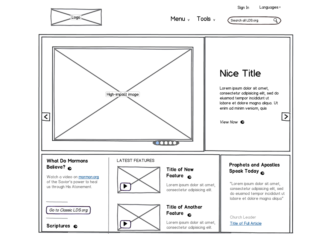
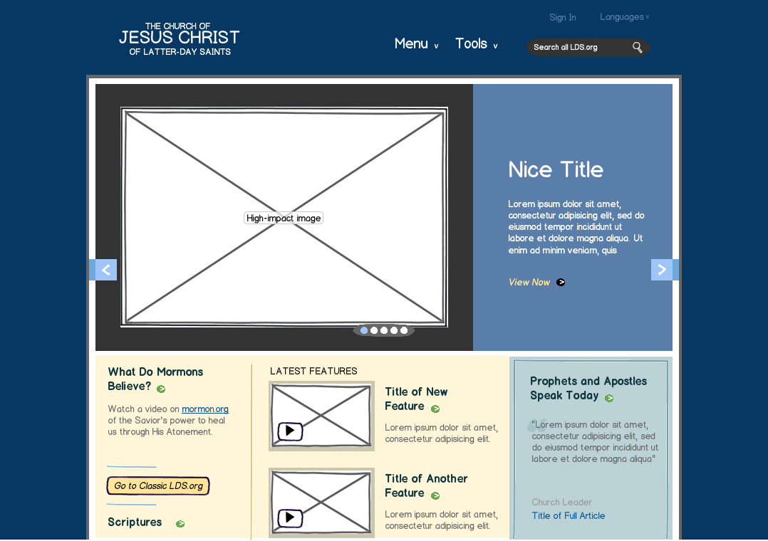
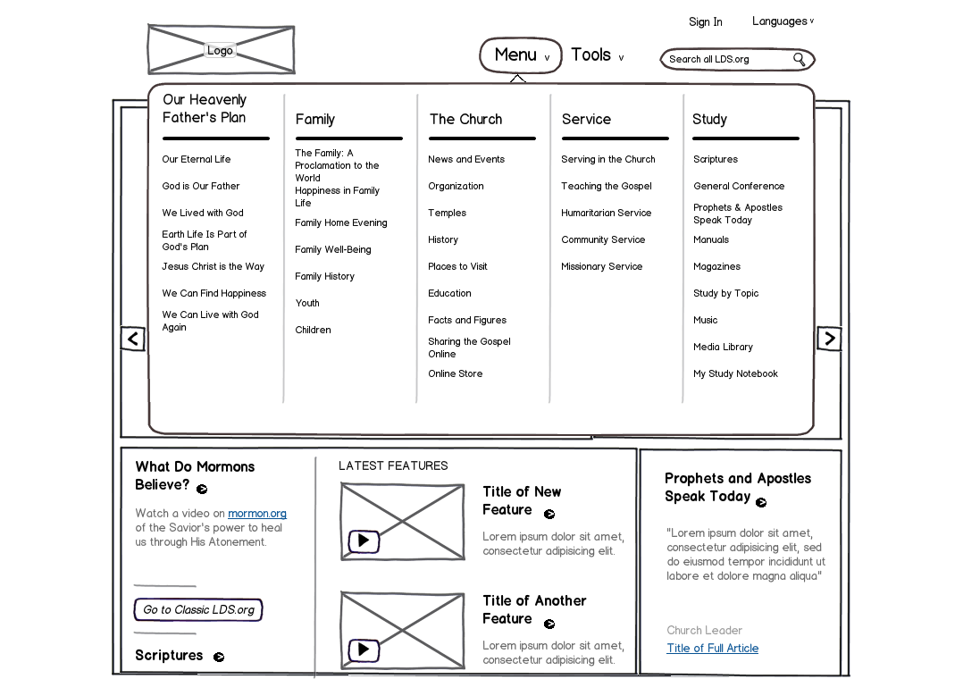
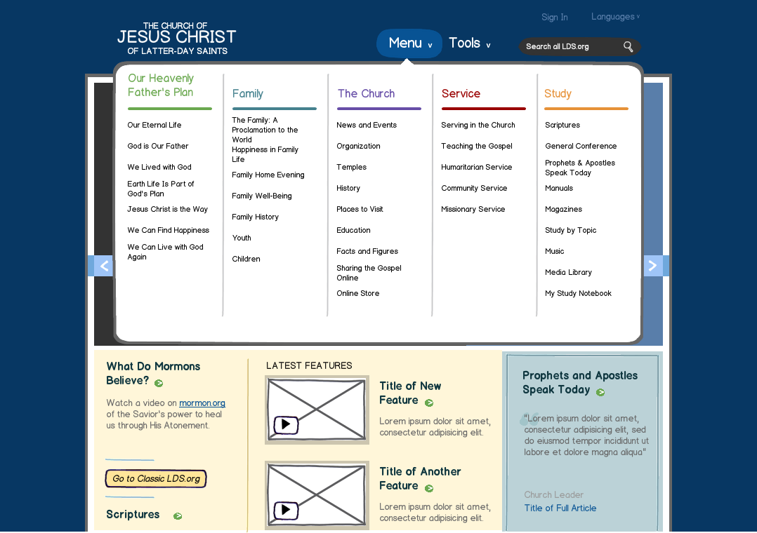
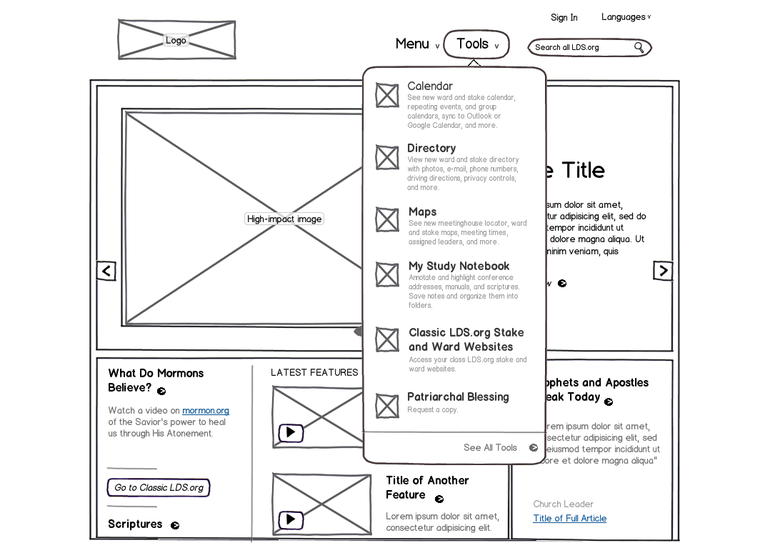
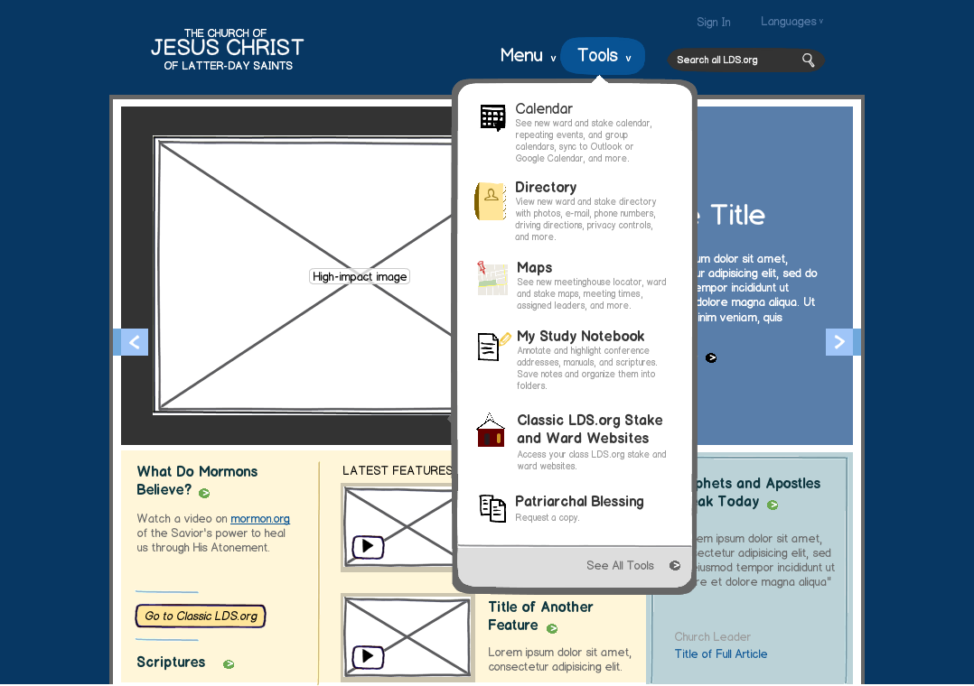
I am pretty sure that making mockups for fun classifies me without question as a nerd, but I’ve come to grips with that. I took an existing website, www.lds.org, and created the mockups that you see below. They clearly illustrate the difference between basic and enhanced mockups.

Basic mockups

The purpose of basic mockups is similar to a sketch on a whiteboard, or a piece of scrap paper. You want to get something visual as quickly as possible so that it is easier to talk about it. Sometimes you need to explain your idea to someone else, and you know that a simple visual aid will help immensely. Other times, you want to explore the functionality of a site or application, and want to keep people focused solely on the function, not on the form. By using a fantastic tool such as Balsamiq Mockups that looks hand-drawn, you are able to keep people focused on what matters most. I have found these to be effective even in conducting some basic usability testing to see if people are able to use your application the way you intend. Iterating at such an early stage saves you significant time and money down the road.

Enhanced mockups

The purpose of enhanced mockups is to show that you have a solid idea that is well on its way to becoming reality. This is still not the final version, so as you are discussing it with people, their focus is not on the skin, but rather on the content and functionality. This is a great way to iterate with your graphic designer as you explore the layout and basic look and feel of your site. I have seen that people look at an enhanced mockup and fill in the final polish with their minds, so it allows them to avoid fixating on a small detail that you have done differently than they were expecting. At the same time, they are able to recognize that you are close to implementing something and they can get excited about the end product.

Basic Home Basic Home

Enhanced Home Enhanced Home

Basic Menu Basic Menu

Enhanced Menu Enhanced Menu

Basic Tools Basic Tools

Enhanced Tools Enhanced Tools


Presentation Creation

Neighborhood House Presentation

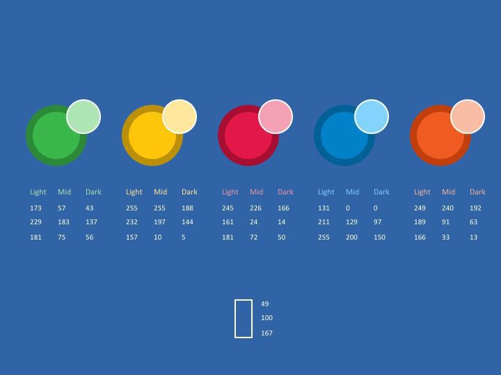
As part of a community-university partnership, I was part of a group that did an evaluation of the Neighborhood House in preparation for accreditation review by NAEYC, the National Association for the Education of Young Children. We were asked to present to the teachers as well as the parents about our efforts, and these are some slides from the presentation I created.

Color palette Color palette

Title Slide

Slide 0

Slide 1

Slide 2

Slide 3

Slide 4

Slide 5


Presentation Recreation

University of Utah Economics Course

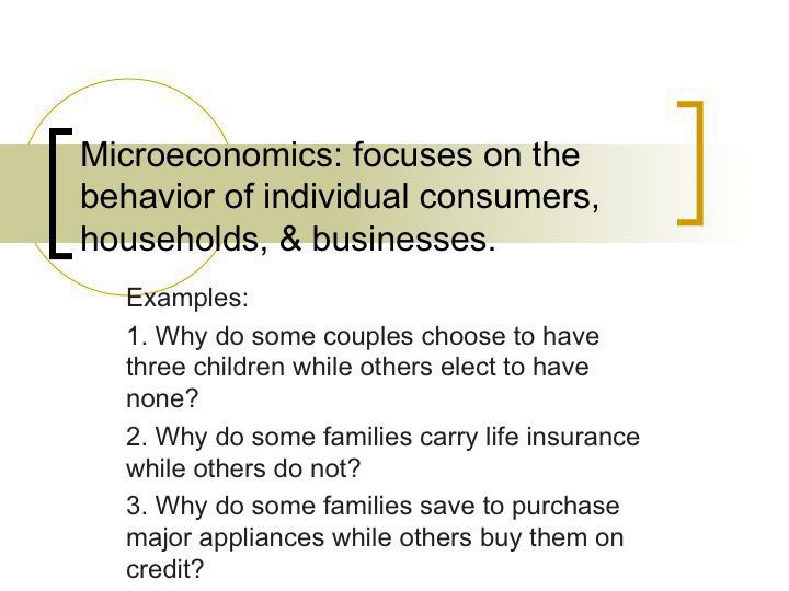
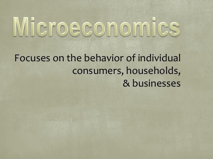
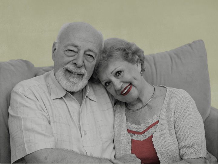
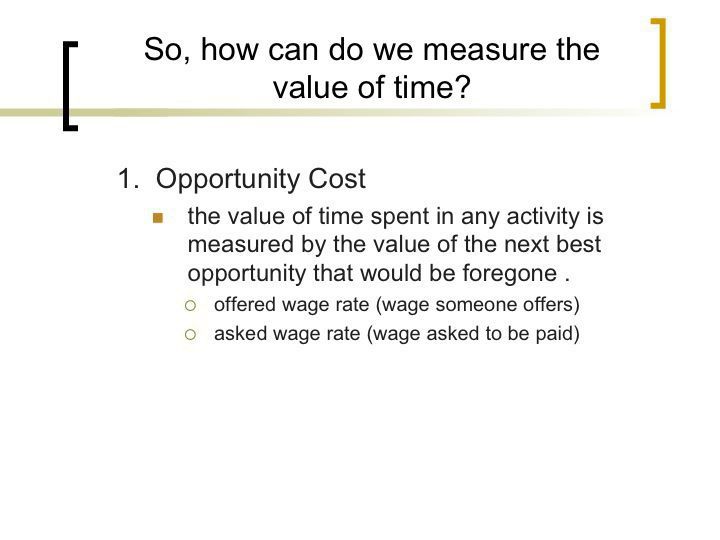
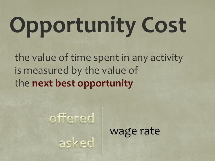
This slide deck was the introduction and beginning of the curriculum for an economics course at the University of Utah. I was asked for help, and decided to invest more time into recreating this deck because it would set the stage for the rest of the course. By pulling most of the text off the slides and into the notes, the presenter still has all the information, but the audience is not trying to read and listen at the same time.

Microeconomics Before Microeconomics Before

Microeconomics After 1 Microeconomics After 1

Microeconomics After 2 Microeconomics After 2

Microeconomics After 3 Microeconomics After 3

Microeconomics After 4 Microeconomics After 4

Microeconomics After 5 Microeconomics After 5

Opportunity Cost Before Opportunity Cost Before

Opportunity Cost After 1 Opportunity Cost After 1

Opportunity Cost After 2 Opportunity Cost After 2


Presentation Clean Up

University of Utah Economics Course

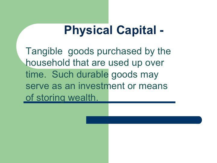
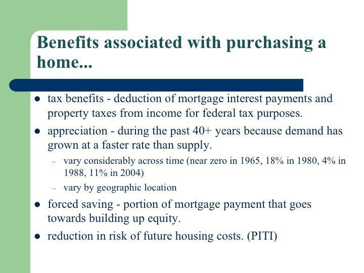
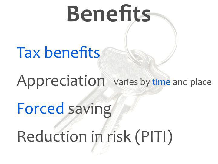
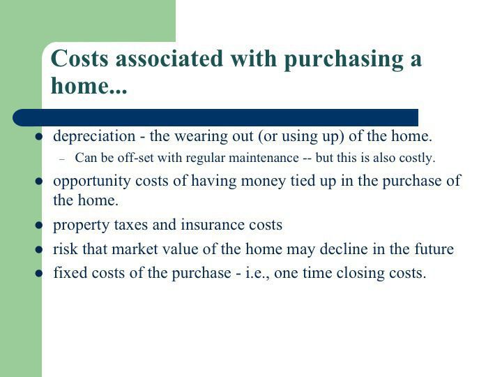
This slide deck was part of a series that comprised the curriculum for an economics course at the University of Utah. I was asked to improve them, and the following is an example of where I just did some clean up.

Capital Before Capital Before

Capital After 1 Capital After 1

Capital After 2 Capital After 2

Capital After 3 Capital After 3

Benefits Before Benefits Before

Benefits After Benefits After

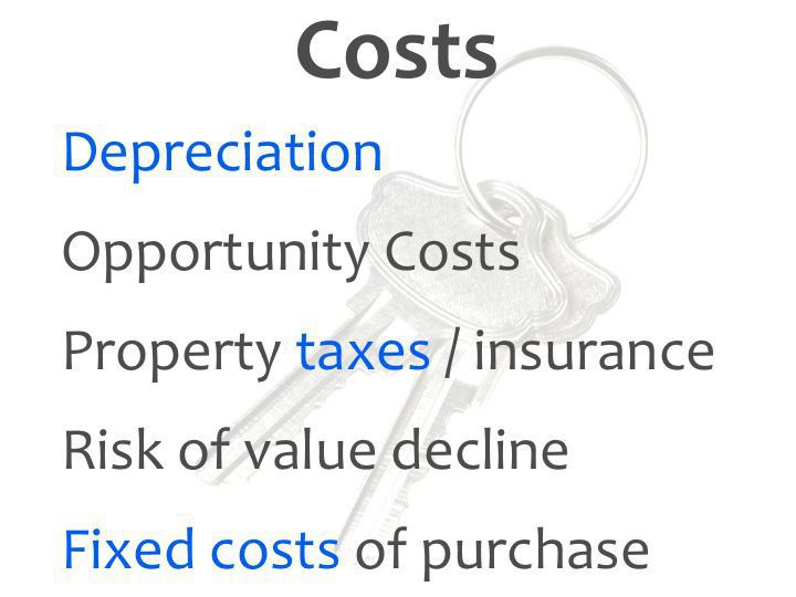
Costs Before Costs Before

Costs After Costs After


Redesign of Teacher Management Interface

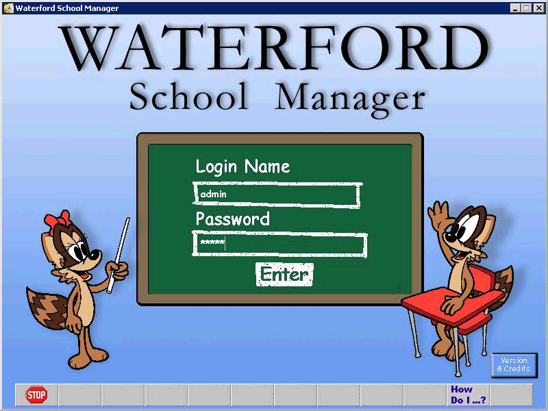
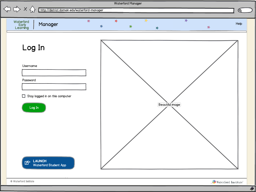
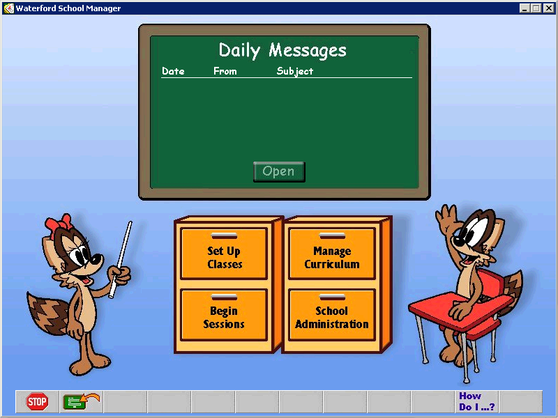
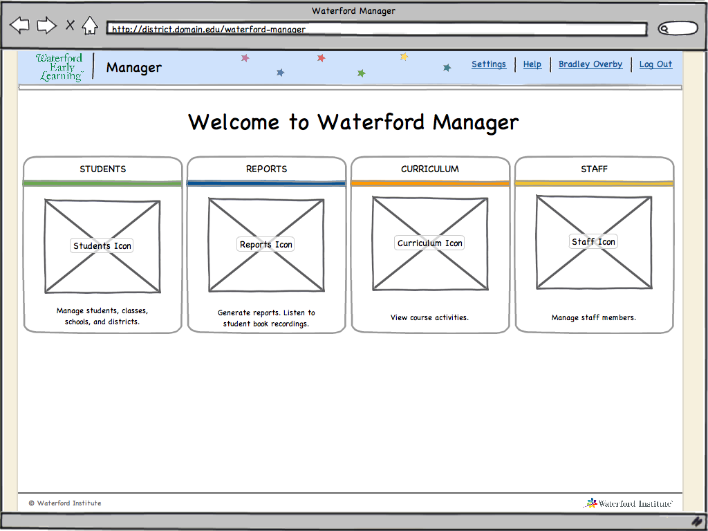
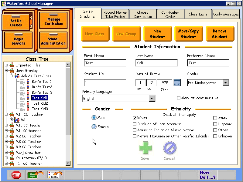
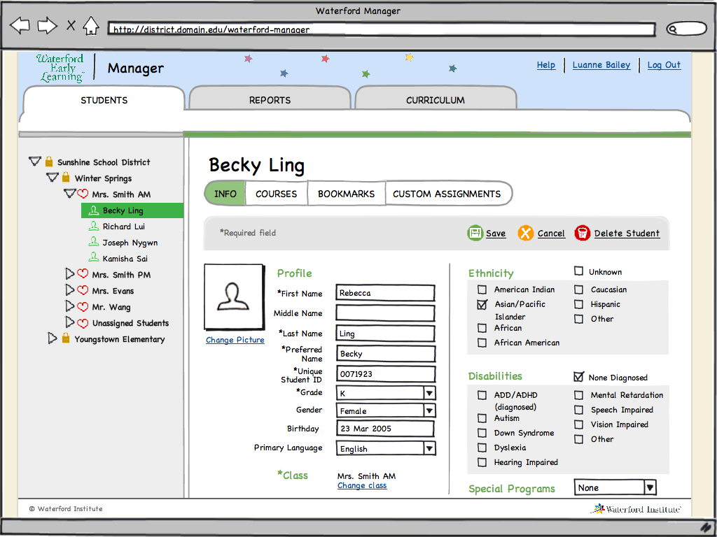
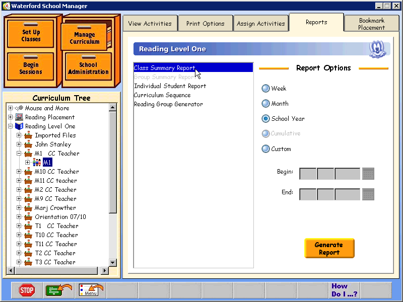
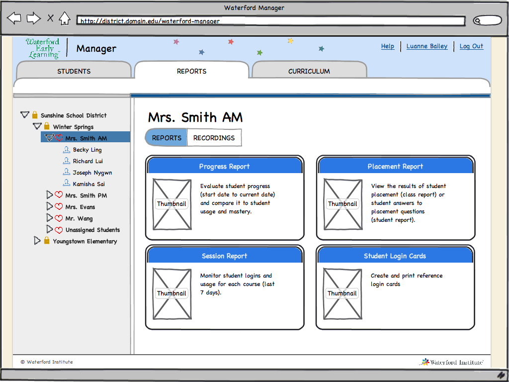
In my day job, I am a Product Owner and UX Designer for a non-profit educational software company, Waterford Institute. In 2010, we tackled an ambitious release of our core educational product. I led a complete redesign of the teacher management interface. Our previous interface had been built over the course of many years, with new features being tacked on wherever possible. We started from the ground up, analyzing the primary jobs that educators needed to perform, and then designing an application to make those jobs quick and simple.

Included here are some screens from the previous version and mockups of the redesigned interface.

Login Before Login Before

Login After Login After

Home Before Home Before

Home After Home After

Student Before Student Before

Student After Student After

Reports Before Reports Before

Reports After Reports After


Corporate Finance Website

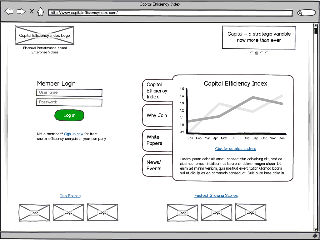
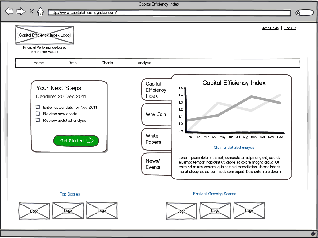
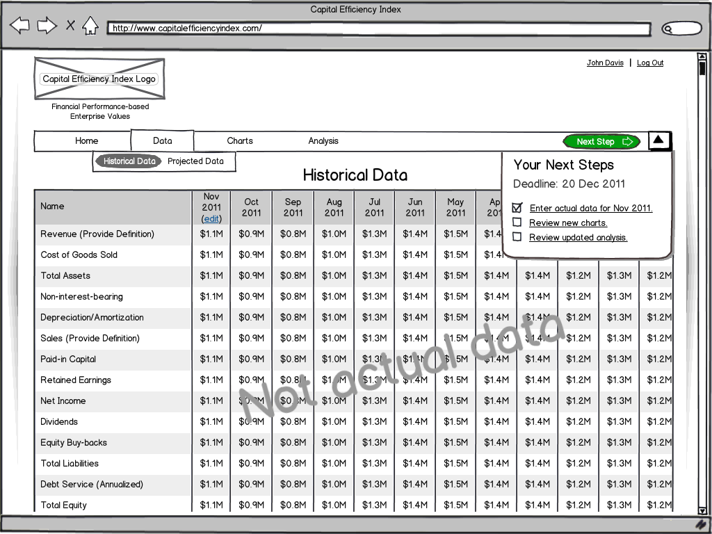
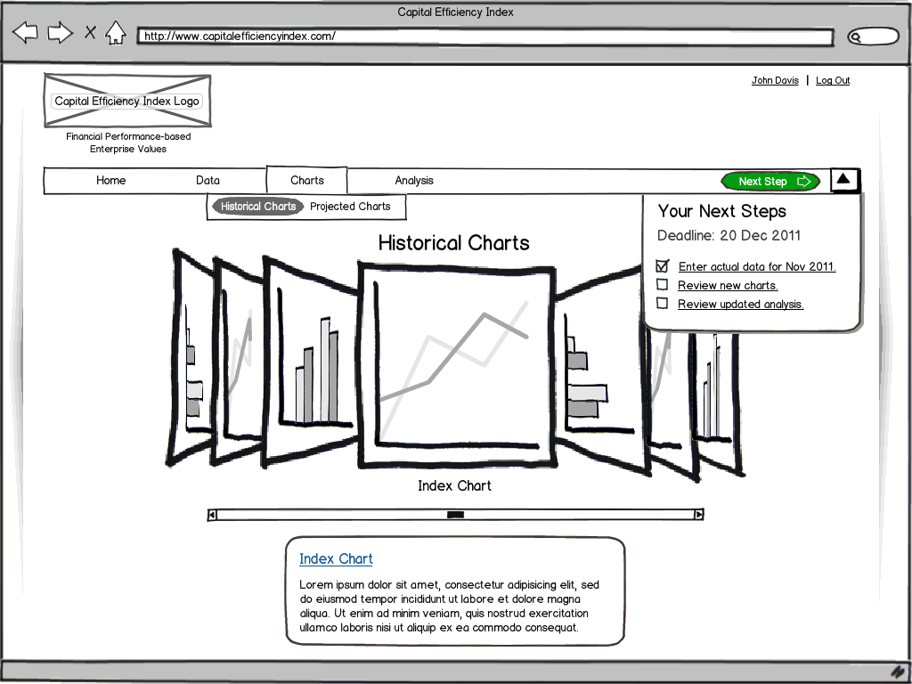
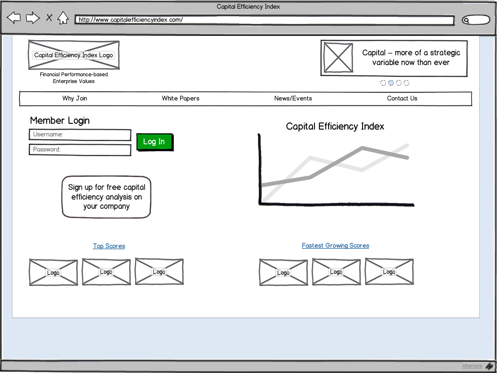
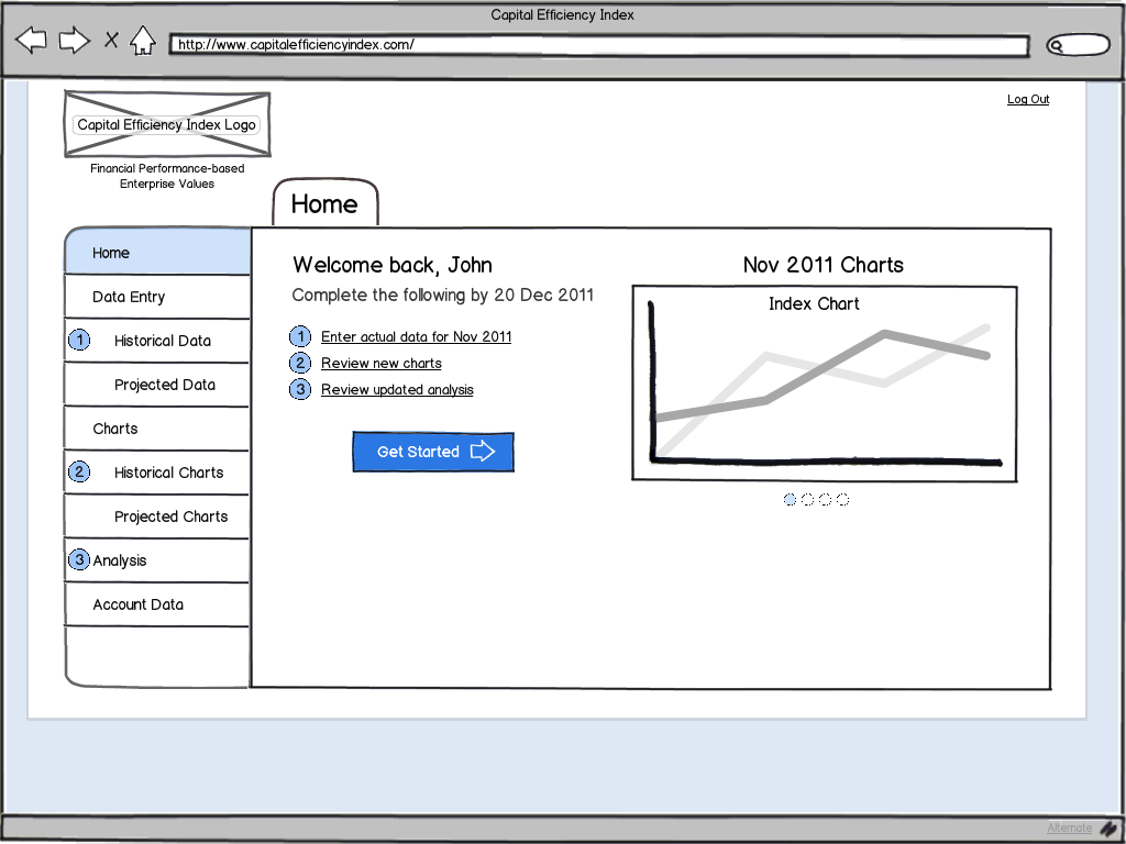
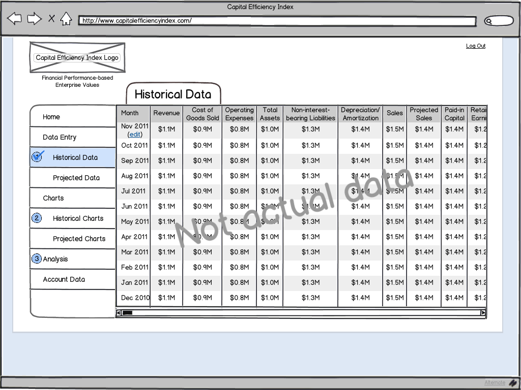
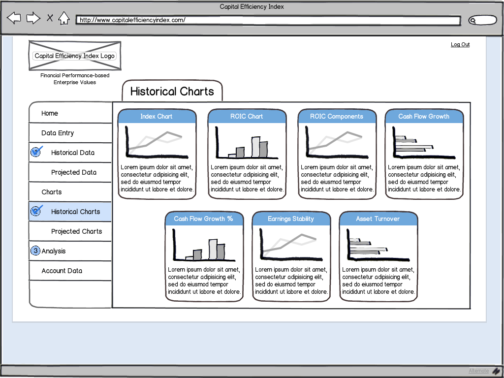
A friend of mine wanted to create a website for corporate finance professionals. His idea is revolutionary, and he wanted help creating a design that he could use in pitching his ideas. Included here are some of the screens that I created as part of two options for his evaluation.

Option 1 Login Option 1 Login

Option 1 Home Option 1 Home

Option 1 Data Option 1 Data

Option 1 Charts Option 1 Charts

Option 2 Login Option 2 Login

Option 2 Home Option 2 Home

Option 2 Data Option 2 Data

Option 2 Charts Option 2 Charts


Home Education

Home education is something that we have been thinking about doing for a while, but after a lackluster kindergarten year, we decided it was time. Following many hours researching different curricula, approaches, and methods, we are using the Charlotte Mason method. She prescribes more of a philosophy about how children should learn, and it fit us and our family well. We found a great website, Ambleside Online, that has taken the ideas of Charlotte Mason and devised a curriculum that we have found to be extremely helpful.

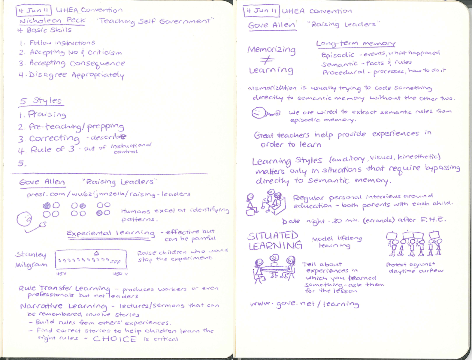
To kick off our first year, on 4 Jun 2011, we attended the annual Utah Home Education Association convention in Salt Lake City, UT. There were a number of great breakout classes to choose from, and we felt like it was well worth our time in attending.

I captured the different sessions in sketchnotes and thought I would share them here:

UHEA Convention Sketchnotes 1

UHEA Convention Sketchnotes 2


Hello world!

All these years of waiting, and I have finally arrived online! This will be my first stab at a website as I gain some more mad skills and figure out how all of this works.

Expect this to change regularly, hopefully for the better. Stay tuned!